Cycle Analysis and the 'Rolex of Charts'
SPX Gold LLY NVO NVDA AVGO COST SOL BTC AVB SPNT PLTR
Macroeconomic Updates
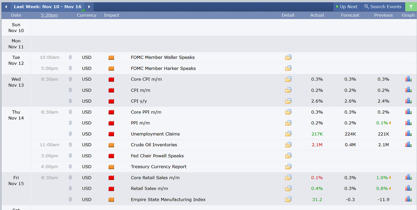
Last week saw economic prints largely come in favorable and in-line with forecasts. The most important data point to keep focused on is employment.
Note from that the downward slope of disinflation is flattening. This is bullish.
Next week will see updates to the purchasing manufacturing index (PMI) and unemployment claims.
Inflation and Rolex’s
Do you wonder what inflation will do next? My prediction is that it will flatten for the next two to three months before beginning to fall more quickly toward the FOMC’s 2% target.
My hypothesis is based on insight from trends in luxury goods. The wealthiest participants in the economy are the least sensitive to economic turbulence. Shifts in demand for luxury goods are a strong predictor for trends that we will begin to observe in core goods in the broader economy.
Below is a comparison of the open market prices for Rolex’s from watchcharts.com and core CPI less food and energy. The Rolex chart isa great datapoint because it is real-time insight into price sentiment in a free market.
Its trend precedes core CPI by 6-8 months, showing us:
Post covid low 6 months early
New post covid high and accelerating inflation 8 months early
Peak inflation 7 months early
If the leading relationship remains consistent, we will see inflation flat to slightly higher, followed by another leg down.
If this is the case, the leg down is where we can anticipate the Fed to respond with more rapid rate reductions (signaling proximity to a top). However, the flattening to slightly rising should bring equities higher as well.
Central Banks and Global Net Liquidity
Combined global net liquidity is shown in the middle pane of the next chart, along with US M2 money supply. The effective Fed funds rate and the market rate for 2 year treasuries are shown in the bottom, along with a sine wave.
There are two cycles in the middle. One is drawn from the Fed funds rate bottom in 2020 to the 2022 bottom in liquidity. The shorter cycle is drawn from the 2021 liquidity peak to the 2022 liquidity trough. This is nearly 1/3 of the cycle drawn before it.
Fib time zones are taken from key areas in the time series. Note that a time zone and the conclusion of the larger and smaller cycle all land in mid February. The sine wave also anticipates that to be the time frame for accelerated rate cuts.
You can find a link to the yellow liquidity indicator here.
This chart shows the US Federal Reserve balance sheet with the following formula:
FRED:WALCL-FRED:RRPONTSYD-FRED:WTREGEN
When taking a 144 period Fib time zone backward from the initial spike in quantitative easing, we can see that the Fed projects the floor for the balance sheet within 144 weeks.
This perspective combines the largest central bank balance sheets using the following formula:
FRED:WALCL+FRED:JPNASSETS*FX_IDC:JPYUSD+ECONOMICS:CNCBBS*FX_IDC:CNYUSD+FRED:ECBASSETSW*FX:EURUSD-FRED:RRPONTSYD-FRED:WTREGEN+ECONOMICS:GBCBBS
Liquidity is now 7.8% lower tan the start of the year, and 4.5% lower than the September high.
Risk assets tend to rise within 6-8 weeks of rising liquidity.
High Yield Interest Spread
The S&P and the high yield rate spread (BAMLH0A0HYM2) have an inverse relationship. Here BAMLH0A0HYM2 is inverted and we are using an indicator called the Follow Line. This uses some aspects of Bollinger band calculation and average true range to identify reversals.
High yield rate spread leveling off is a warning. Rolling over is the confirmation. It is bullish when it is falling like this (visually rising as it’s inverted on the chart).
The rate spread is incorporated into the “Misery Index” which adds inflation rate, unemployment rate, and high yield rate spread. This is currently bullish.
Credit Cycle
Below is a global credit cycle analysis. The middle pane uses Chinese 10 year yield divided by DXY divided by the high yield rate spread as a proxy for availability, cost, and demand for credit. The bottom pane is the correlation between the credit cycle and the S&P.
Times in which the S&P shifts from strong positive correlation to strong negative correlation represent disparity between credit and risk assets.
Fibonacci time zones are draw from peak to peak, peak to trough, and/or trough to trough in the credit cycle and in the correlation coefficient. Clusters of time zones (like the one in June) tend to be meaningful. We have one coming up in February 2025, which would line up with the lag in trend from the watch chart.
Dominance- USDT BTC Total3
The dominance of the largest stable coins has a strong inverse relationship with bitcoin and altcoins. USDT is falling sharply. If it flattens we will know that we are at a local top. If bitcoin flattens while USDT is falling, it will be altcoin season.
Market Updates
Trend
We are in a bull market. We remain in a strong primary uptrend. The S&P is below the 5 day SMA and the 5 day SMA is downward sloped. I treat this as cautionary for new buying in trend following strategies.
DXY is strongest in all time frames. Treasuries have picked up in the short-term. Gold and equities have cooled in the short-term. No signs of life from commodities.
Semi’s, tech, and healthcare had the worst showings last week. The composite market breadth score moved to neutral.
Seasonality
Recall that November begins the strongest 6 month stretch for the S&P and the strongest 8 month stretch for the Nasdaq.
November and December are two of the higher performing months of the year during election years.
6 weeks left! The middle of November is the weaker timeframe of the remaining two months of the year. Last week was an options expiration, and November options expiration is historically weak for the broader market.
Risk Monitoring
It is prudent to be cautions when drawing down from a new 52 week high and when we are below downward sloping 5 day moving averages. However, these trends are still strongly bullish.
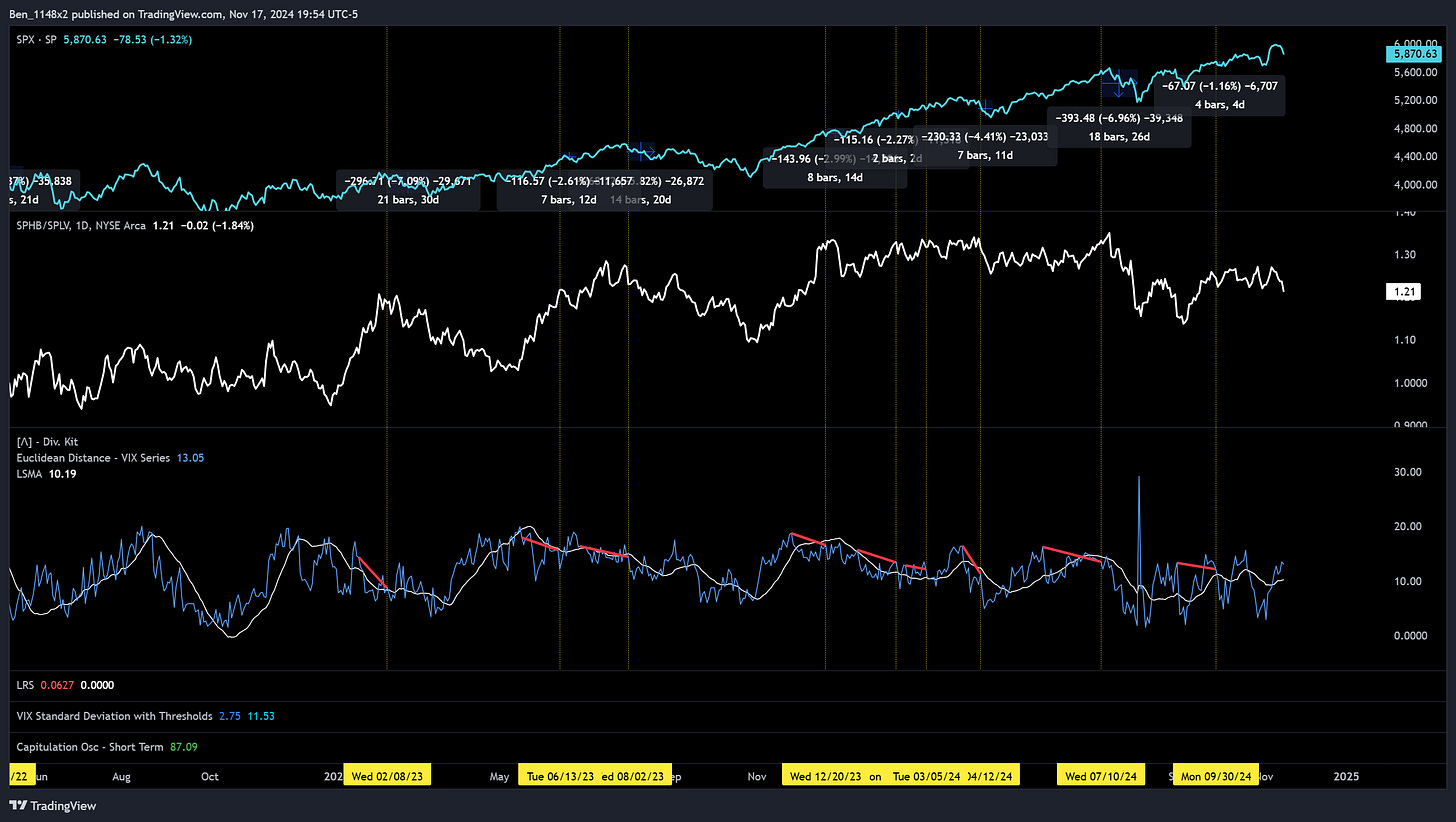
VIX
The VIX has curled upward again. We see a series of lower highs and lower lows, but it has not crossed back below the centerline in the regression channel.
Trading strategies with regression channels can be thought of similarly to Bollinger bands. A break above or below is a sign of a directional move to go long or short. And then the position is closed when a counter trend move crosses the center of the band.
That is the context for mentioning the importance of the center band. The VIX trades differently than equities, but I considering there to be elevated risk until we see the VIX cross back below the center.
There is no risk signal on the Euclidean distance indicator.
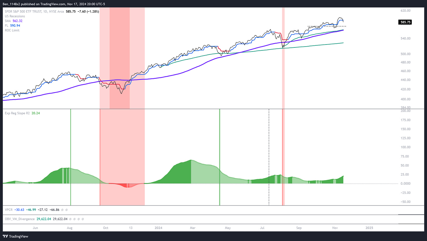
Volatility weighted put/call ratio. Using equal weighted VIX VXD ATR and William’s VIX fix as measures of volatility. Fancy smoothing applied. Green cloud = bullish.
The bottom indicator annualizes the exponential regression of trend and then applies coefficient of determinant to gauge whether price action correlates to trend.
Green = Bullish
The black vertical line is ~3 trading months. A red vertical line appears if:
exponential r^2 is <=0
price falls below the 100sma
we have a single day with an absolute change >=10%
The green vertical line paints when it’s been ~3 months from the last occurrence of those signals. This is further evidence of a consistent and sustained uptrend.
Sectors
We need to pay careful attention to sector performance. The tec
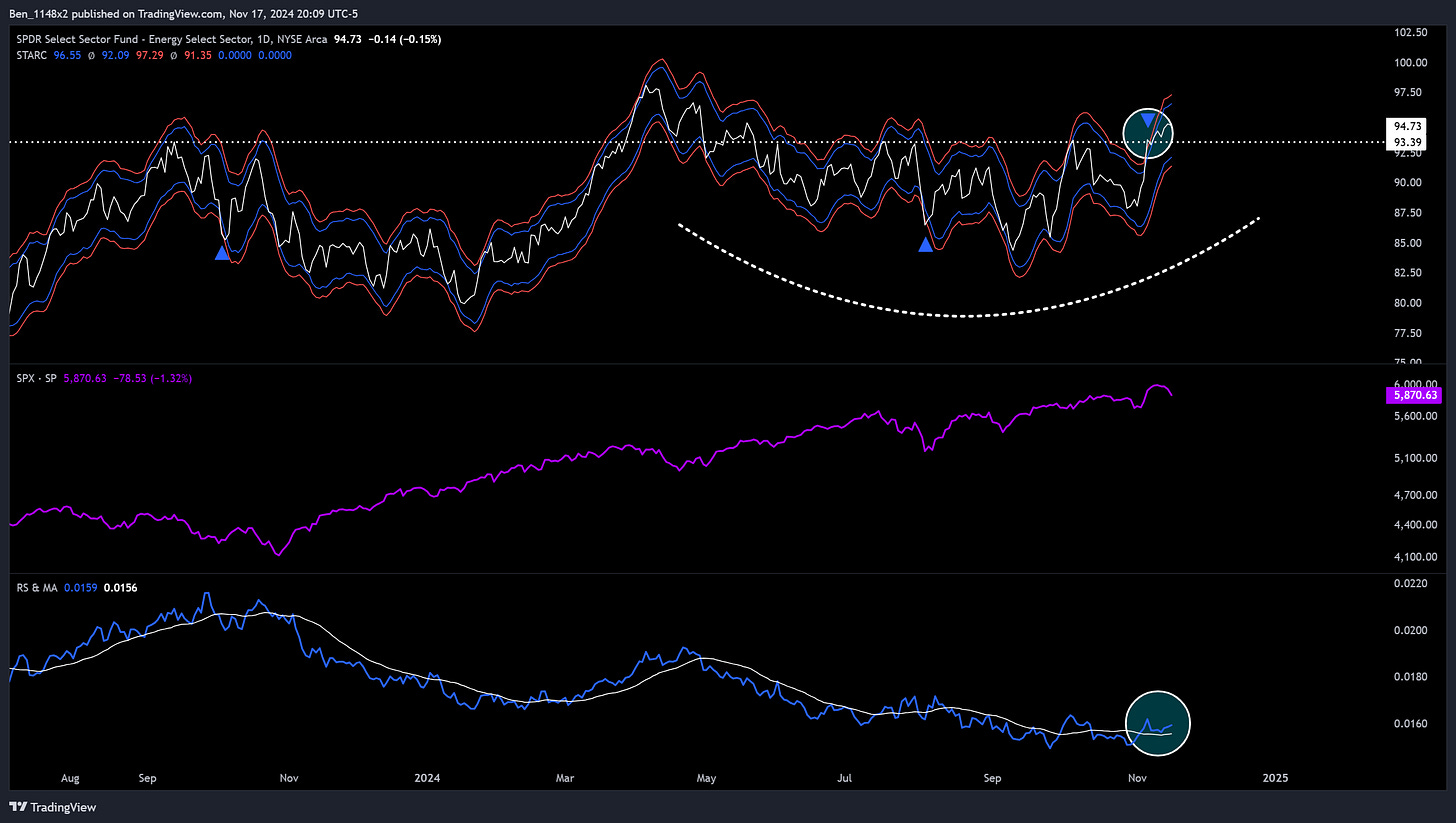
Energy
There is subtle evidence of energy recovering. We’ve emerging from a rounded base (one of my favorite patterns), breaking out of the STARC band envelops. STARC is a tighter band system that reveals changes in trend more clearly. The break above the band envelope also reclaimed the 2023 high and retested as support.
The relative strength comparison below also shows a break above and retest of the trendline.
Financials
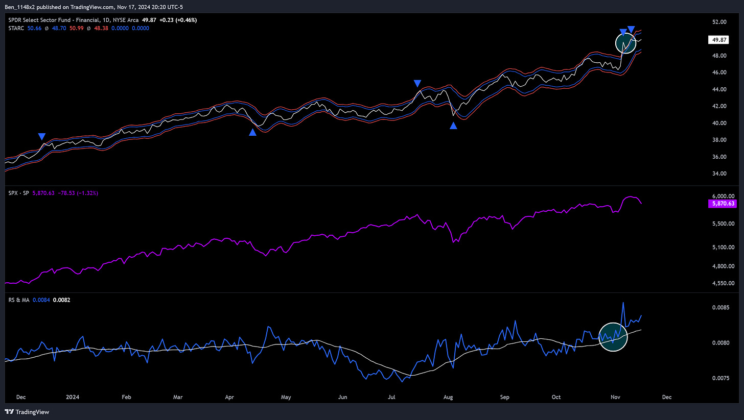
Financials look strong. I’m open to the possibility of the recent breaks above the STARC envelope being exhaustive, but would consider adding to financials on a pullback.
Health
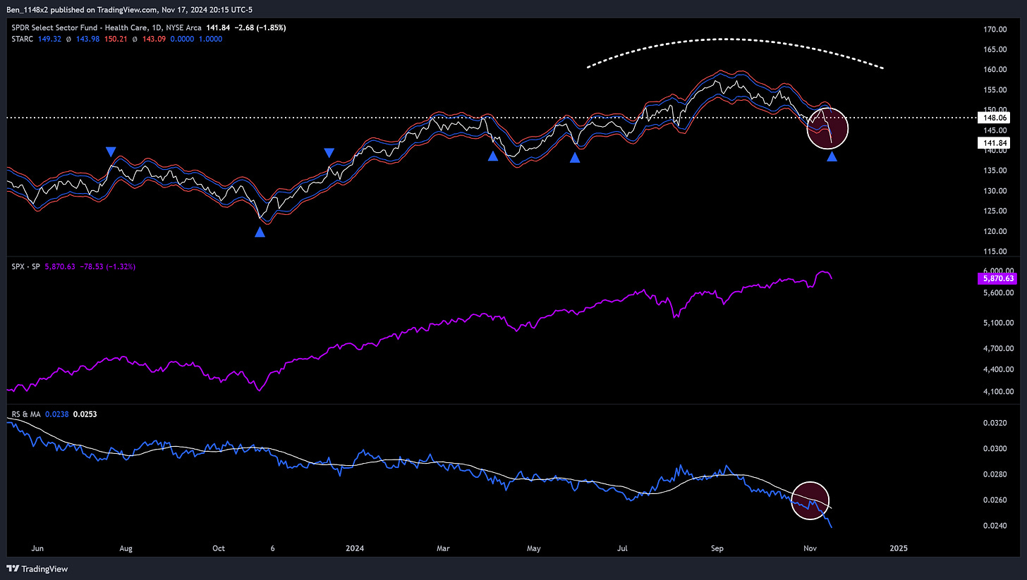
The market is reacting to Trump picking RFK to handle health. I’m not sure how legitimately concerned we should be, but the sector was already showing weakness. Here we see the opposite of what energy is showing. Rounded top, downside breakout of the STARC band envelope, and a break below high at the start of the prior base.
Note relative strength breaking below the moving average and then resisting it on a retest.
Tech
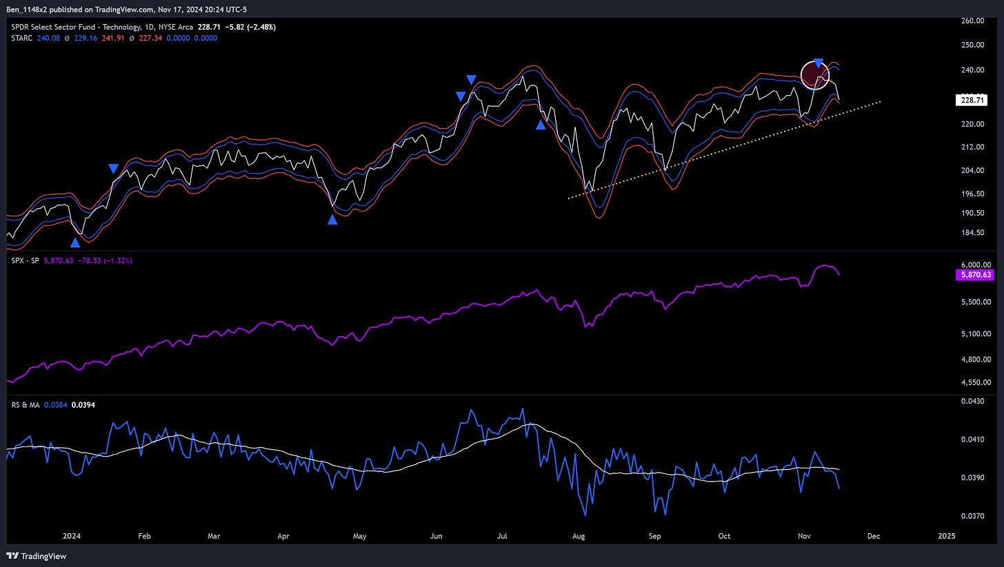
We broke above the band envelope and reversed. Failure to continue higher after a break above is a bearish warning. Note all of the failed attempts to reestablish relative strength.
Semis
Semi’s have a catalyst this week with NVDA reporting. They’ve fared better than broader tech, but are in a clear sideways consolidation and have just lost relative strength to the S&P.
This is where we will get more heavily into cycles. This is a recreation of a chart that Rickus has shared in the past. I highly recommend following him. He has a great read on cycles and shares a lot of unique and clear technical analysis.
One of which is the cycle analysis. I would not have found this on my own.
The peaks in RSI identify the point at which the slope of the trend for semiconductors (purple) shifts to a slower pace of price appreciation. At those transitions we se the S&P (light blue) accelerate. This is confirmed by the flat to downward sloping relative strength line (light purple) that divides SMH by the S&P.
We can possibly think of these cycles as an extended period of time where the market is refreshing hardware and adopting new technology, followed by a short period in which the broader market begins to deliver the benefits of the improvement in tech. They conclude with a drawdown in both.
Regardless of the reasons behind the cycle, the experience is clearly observed and is something that we can capitalize on. Now is not a time for me to enter new long semi positions, or to add to existing positions on retraces. Now is the time for me to realize profits and only remain in the strongest names.
Speaking of which, year-to-date, NVDA remains the strongest in the sector. Despite falling quite a bit, ARM is in second place, and AVGO is in 3rd.
Cycles
Cycle analysis is its own discipline in technical analysis and economics. There are a number of methods, and some are very specific to markets, indices, individual assets, and the overall economy.
I incorporate seasonality and presidential cycles heavily, which are fixed cycles. The cycle charts for semi’s are using fixed cycle drawings. I also use Fibonacci time zones, which are variable cycles (with distance changing at each interval).
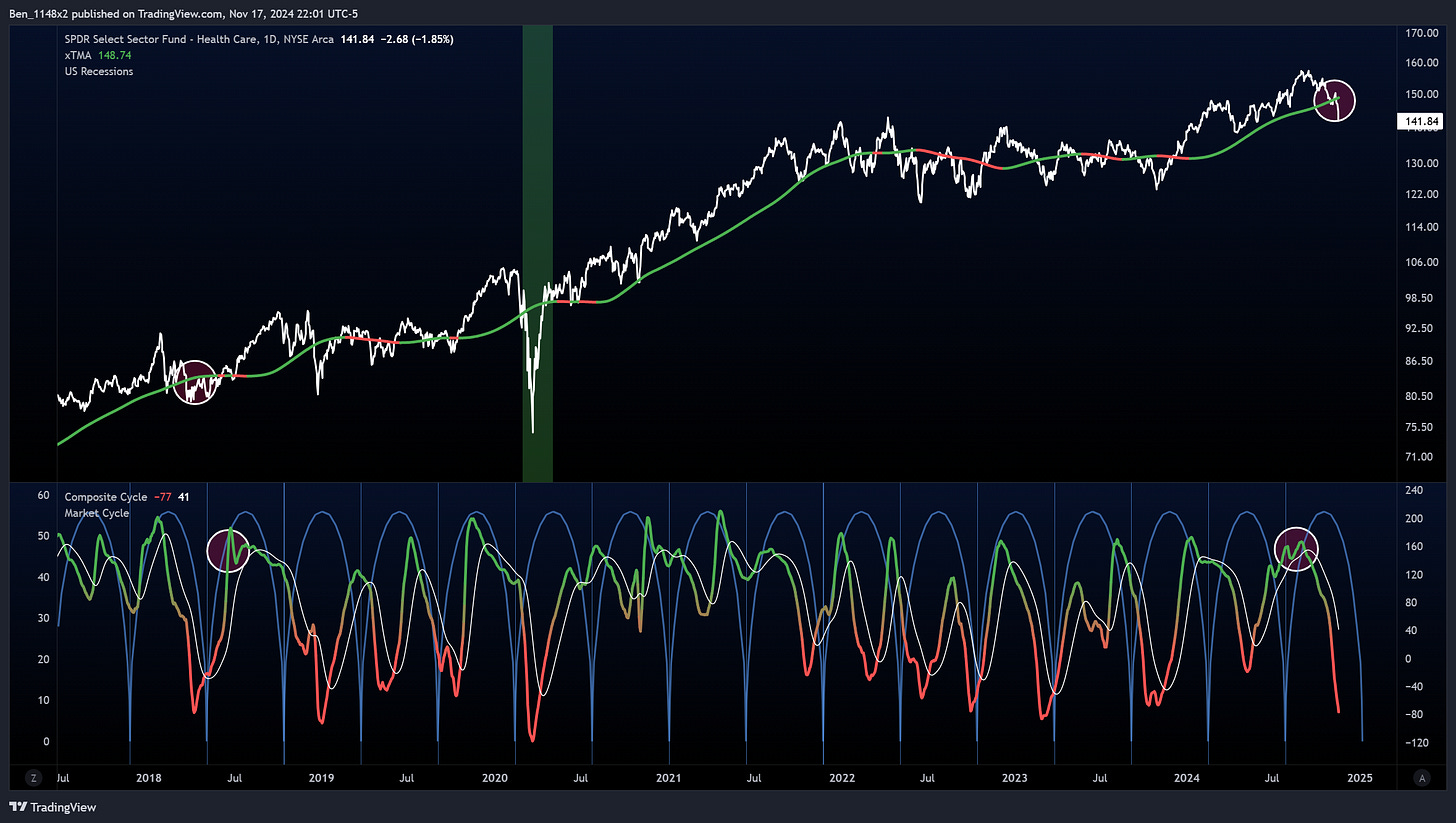
This week we’ll take a look at composite cycles. When using a composite cycle we look for a moving average that aligns to the cycle length (gauged by observing major peaks and troughs in the long-term primary trend). We then apply additional moving averages that are shorter than the first. These are commonly 1/2 of the prior moving average, but some technicians have found instances in which dividing into 1/3’s more effective. These are called harmonics.
The cycles are then added together to form a composite. The peak and trough of the composite then displays the cycle behavior. At the beginning and end of the cycle, all of the moving averages trend in the same direction. In the middle of cycles we observe a mid-cycle dip.
I did not see a cycle tool that did this on Tradingview and coded this one. When we add moving averages for assets in uptrends we should see a line that move up and to the right. To visualize the cycle movement across the time series we need to normalize the data into an oscillator. In this case, I am using the z-score to index the amplitude to the length of the measurement period.
These charts will all use roughly 6 months as the fixed cycle. This is one the timeframes that was used by both J.M. Hurst and William C. Garrett, who are both well known for their contributions to cycle analysis.
This timeframe seemed to work well in identifying cycle movement for several assets and sectors. I am also using a triangular moving average, which is a similar concept. It takes the length of the moving average and weights it by the result of a moving average half of its size. This gives emphasis to the middle of the data series which helps us to see the overall trend more clearly.
What stands out with the S&P is that it looks like we will see a right translated cycle period. When a cycle has a trough near the beginning it is considered left translated and is bullish. It is a bearish warning when we see a peak at the beginning of a cycle like we do in June 2018, November 2019, January 2022, and June 2023.
This implies higher possibility of a trough at the end of the cycle, which would be the mid February timeframe. That has confluence with cycle methods discussed earlier.
Semiconductors
While currently down, are in proximity to a high in the middle of a cycle.
The relative strength of semis and the S&P shares a clear warning.
BTC
We’re seeing tremendous strength here and it doesn’t not feel like we’ve seen broad FOMO.
Notice that breaking a descending trend of cycle peaks is followed by a strong upward movement.
Altcoins
The composite cycle for altcoins looks a lot like it did in late 2020.
Gold
Gold continues to show strength. I am looking to add to my position as we see the current retrace clam down.
Healthcare
Earnings
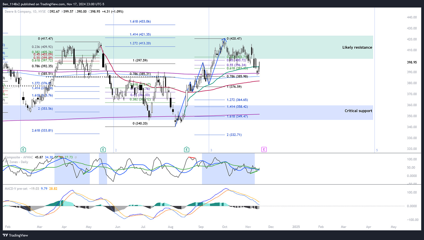
Some companies of interest reporting this week. The market will have its eyes on NVDA. I’m interested in results for WMT LOW PANW and DE.
Individual Opportunities
SOL
If considering altcoins, compare their performance relative to BTC. A new relative cycle high will signal a larger move upward.
SOL looks like it has potential to make this move. This chart uses the Williams VIX fix to measure volatility, and the bottom indicator is a new. It combines an indicator called TRIX ( a triple smoothed oscillator) with the strength oscillator (trend direction), and then normalizes the result by volume and average true range. We will want to see this indicator continue the move higher prior to VIX fix showing an increase n volatility.
LLY
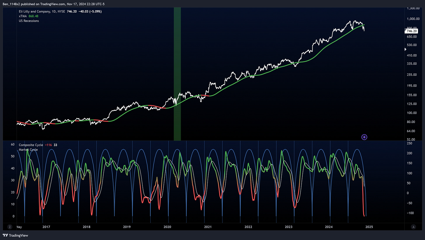
LLY is in a tough secondary downtrend. Note that the current cycle was bearishly right translated. In 2016 and 2018 this was followed by a period of sideways consolidation.
The green anchored volume weighed average price is anchored to the August 2023 gap up. If this holds as support it will be a strong sign for the remaining sentiment in the GLP1 narrative. If it fails we likely see a move to 675, which has confluence with the February gap and the 1.618 fib level.
NVO
This breakdown is ugly. The gap down on Friday fell through the fib fan and puts the full measured range of the forecast in play.
PANW
PANW likes proportional movements. Overhead targets are 423 and 443. Invalidated with a move below 383. I don’t like getting involved with short term positions prior to earnings.
NVDA
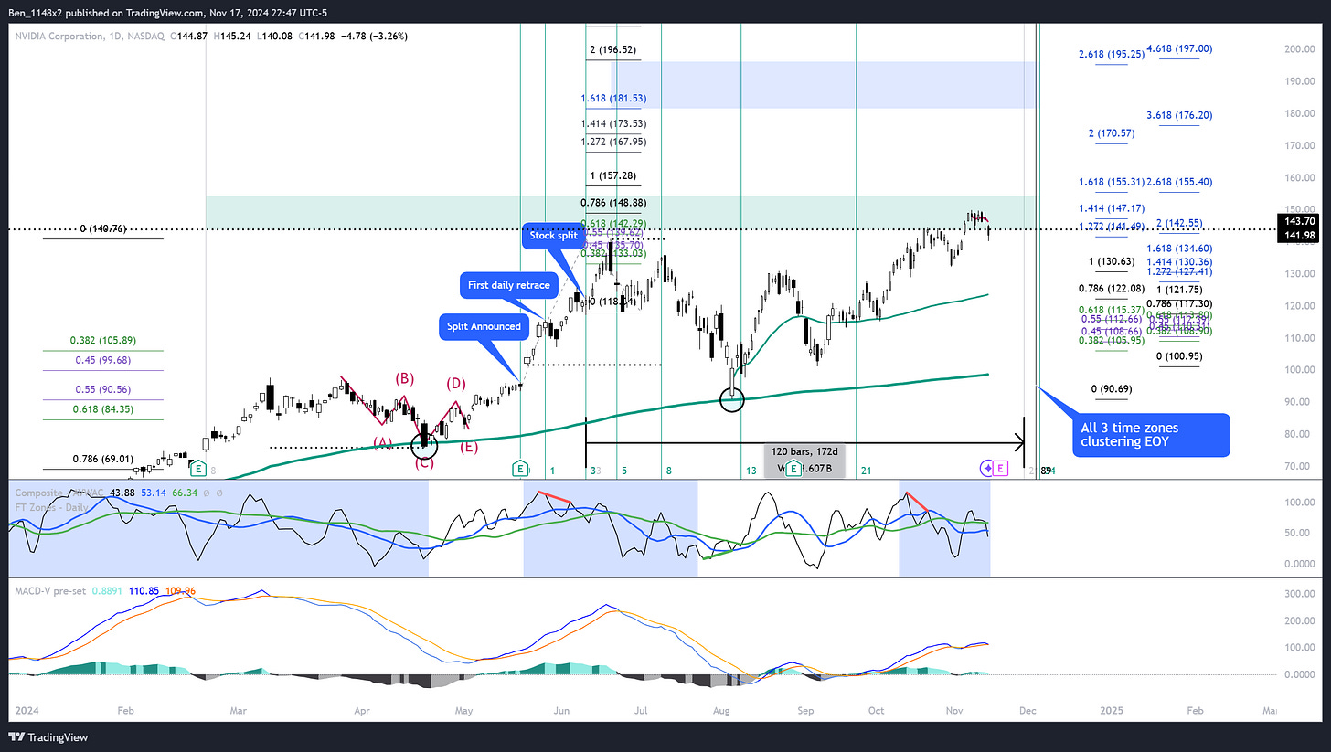
NVDA continues to look very bullish. We have a bullish left translated cycle.
I’m not wild about seeing NVDA fall back below the initial forecast. We are also getting close to the time zone cluster at the end of the year. I’ll likely take profit and exit my short term position here and leave my long-term holdings in place.
AVGO
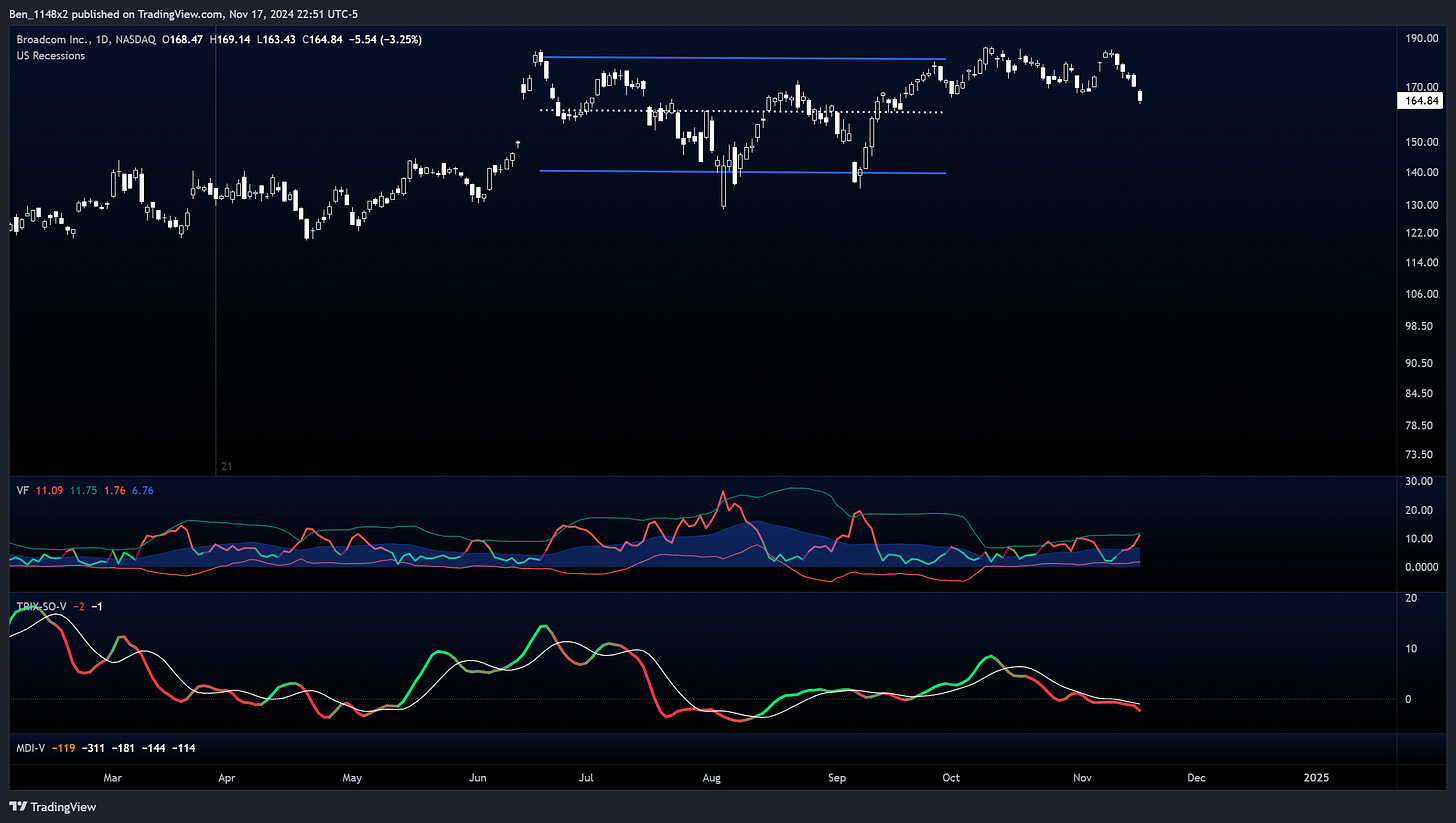
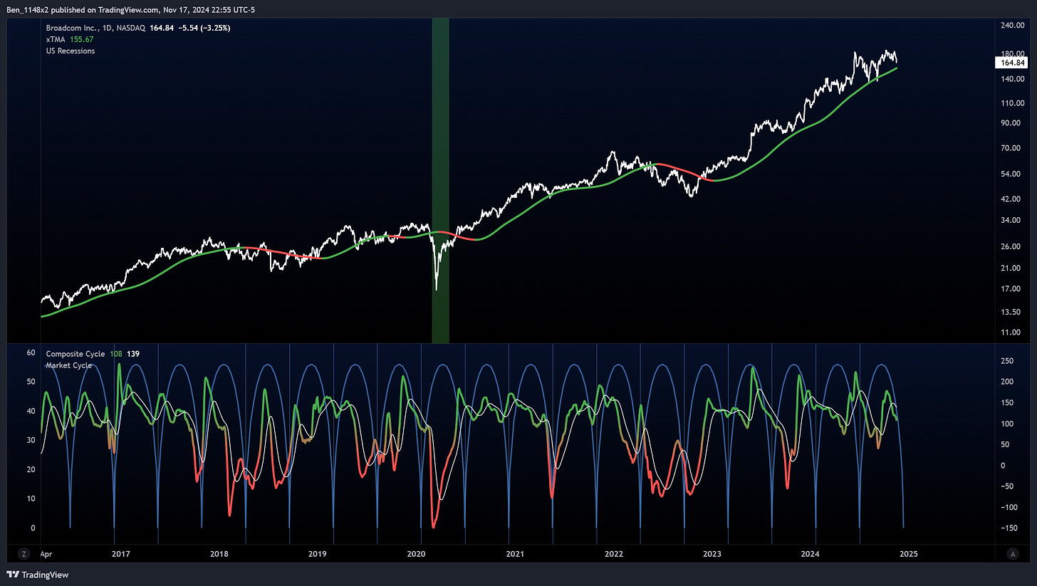
AVGO is likely to move in correlation to NVDA this week. We have a failed channel breakout, strength into a downtrend on the TRIX-SO, and the VIX fix threatening to breakout of its band.
A retest of 150 seems likely.
LOW
I’d like to see LOW hold this level heading into earnings.
DE
A three year long sideways consolidation.
Which makes updating this chart very easy. The support and resistance zones remain the same.
PLTR
One of William O’Neil’s guidelines was that when a company surged over 20% within a short time frame, to hold it for 8 weeks from the start of that move. These have high likelihood to form a high and tight flag and then move higher. I’m following this strategy for PLTR.
AVB
REITs started showing strength at the end of last week. A number of them have these rounded bases. AVB has a combination of a positive cross over with the market direction index, rising TRIX-SO, and volatility compression in the VIX fix.
The last 5 times that we saw this combination produced an average return of 21%.
SPNT
Similar story with SPNT. Property and casualty insurance. The prior times that we saw this favorable combination among these indicators produced a strong move higher.
COST
COST has hit its forecast. WMT and COST are two of the best performing consumer staples. They straddle the discretionary space.
Recall that COST has nearly perfect performance in the month of November.
The KST and Chaikin oscillator system extends its 100% success record with COST with an 8.5% move in line with prior history.


